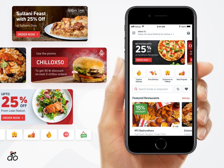
Pathao Food 3.0 - Discovery Experience Revamp

We've released the Pathao Food 3.0 a couple of weeks back, introduced a new layout for the food homepage to ensure better restaurant discovery experience, and improved on a few other areas. Previously, the offers and campaign cards were placed below as a collapsed bottom sheet which was resulting in an unsatisfactory conversion rate. We replanned those cards to be visually more appealing and placed at the top with auto sliding. Better perceptibility and more engagements are being seen.


