10 UI Design Patterns Every Designer Should Know
As a UI designer, it is essential to have an understanding of design patterns. Design patterns refer to reusable solutions to common design problems. They are known as best practices in the design industry and are used to create effective, user-friendly interfaces. In this article, I will discuss the top 10 UI design patterns every designer should know.
What are UI Design Patterns?
UI design patterns are reusable solutions to common design problems. They are like templates that designers can use to create interfaces that are easy to use and navigate. These patterns provide consistency across different interfaces, making it easier for users to understand how to interact with the interface.
UI design patterns are used to solve specific design problems. They are not meant to be used as a one-size-fits-all solution. Instead, they should be used as a guide to create interfaces that are tailored to the specific needs of the user.
The Most Important UI Design Patterns
There are several UI design patterns, but some are more important than others. The following are the top 10 UI design patterns every designer should know:
1. Navigation
Navigation is one of the most important UI design patterns. It refers to the way users move around an interface. Navigation should be easy to understand and use. It should also be consistent across different pages.
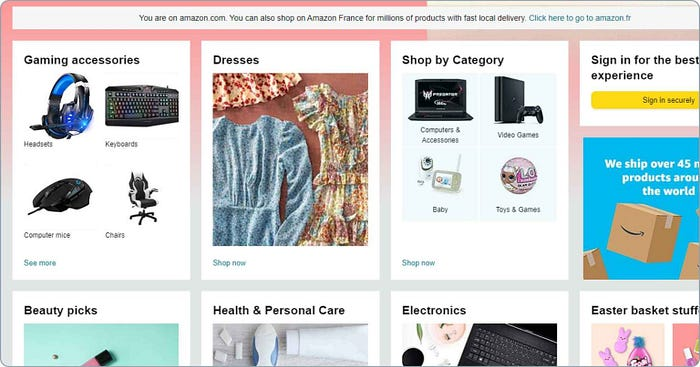
One example of a project that uses navigation is the Amazon website. The navigation is easy to use and consistent across different pages.
2. Forms
Forms are used to collect information from users. They should be easy to use and understand. Forms should also be designed in a way that minimizes errors.
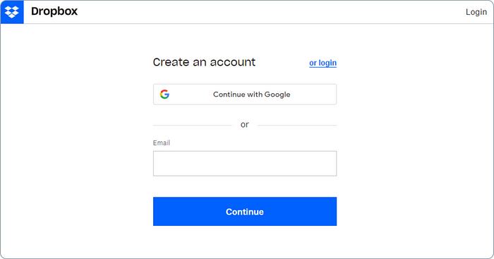
One example of a project that uses forms is the Dropbox sign-up page. The form is easy to use and understand, and it minimizes errors.
3. Search
Search is used to help users find information on a website or application. Search should be easy to find and use. It should also be designed in a way that provides relevant results.
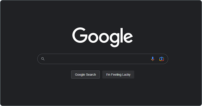
One example of a project that uses search is the Google search engine. The search is easy to find and use, and it provides relevant results.
4. Notifications
Notifications are used to inform users of important events or updates. They should be designed in a way that is not intrusive and can be dismissed easily.
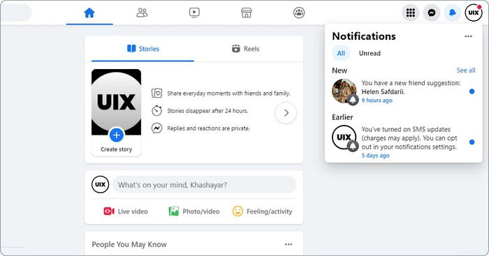
One example of a project that uses notifications is the Facebook notification system. The notifications are not intrusive, and they can be dismissed easily.
5. Cards
Cards are used to display information in a way that is easy to understand. They should be designed in a way that is consistent across different cards.
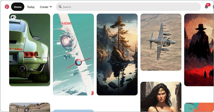
One example of a project that uses cards is the Pinterest website. The cards are easy to understand, and they are consistent across different pins.
6. Modals
Modals are used to display information that requires user input. They should be designed in a way that is easy to use and understand. They should also be designed in a way that can be dismissed easily.
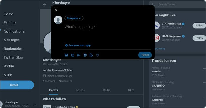
One example of a project that uses modals is the Twitter tweet box. The modal is easy to use and understand, and it can be dismissed easily.
7. Tooltips
Tooltips are used to provide additional information about an element. They should be designed in a way that is not intrusive and can be dismissed easily.
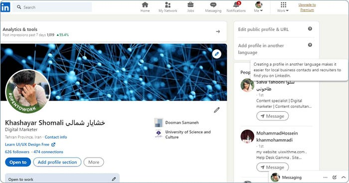
One example of a project that uses tooltips is the LinkedIn website. The tooltips provide additional information about different elements, and they are not intrusive.
8. Accordions
Accordions are used to display information in a way that saves space. They should be designed in a way that is easy to use and understand.
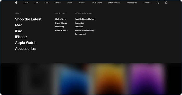
One example of a project that uses accordions is the Apple website. The accordions save space, and they are easy to use and understand.
9. Carousels
Carousels are used to display multiple pieces of content in a small space. They should be designed in a way that is easy to use and understand.
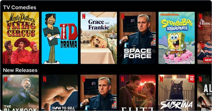
One example of a project that uses carousels is the Netflix website. The carousels are easy to use and understand, and they display multiple pieces of content in a small space.
10. Sliders
Sliders are used to display content that requires user input. They should be designed in a way that is easy to use and understand.
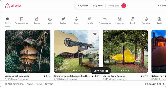
One example of a project that uses sliders is the Airbnb website. The sliders are easy to use and understand, and they display content that requires user input.
The Advantages and Disadvantages of UI Design Patterns
UI design patterns have several advantages. They provide consistency across different interfaces, making it easier for users to understand how to interact with the interface. They also save time and effort, as designers do not have to reinvent the wheel every time they encounter a design problem.
However, UI design patterns also have some disadvantages. They can make interfaces feel boring and predictable. They can also limit creativity and innovation, as designers may feel restricted by the patterns.
Applying UI Design Patterns in your Portfolio
To apply UI design patterns in your portfolio, you need to have a good understanding of each pattern. You should be able to identify which pattern is best suited for a particular design problem.
When creating your portfolio, you should showcase your ability to use different UI design patterns. You can do this by creating different projects that use different patterns. This will show potential clients and employers that you have a good understanding of UI design patterns and can apply them to create effective interfaces.
Conclusion
UI design patterns are essential for creating effective interfaces. They provide consistency across different interfaces, making it easier for users to understand how to interact with the interface. As a designer, it is important to have a good understanding of different UI design patterns and how to apply them in your portfolio. By showcasing your ability to use different patterns, you can demonstrate to potential clients and employers that you have a good understanding of UI design patterns and can create effective interfaces.


